Monday, 28 February 2011

Target audience questionnaire

How old are you? (tick the following which applied to you)

10 or under
11-15
16-20
21-25
26-30
31-40
41+


What genre do you listen to the most?

Rock
Pop
Indie
Jazz
Other (name below)

What attracts you to a new band?

Fashion
Appearance
Gender
Particular and members
Their logo
Other (name below)


Do the clothes that the artists/band wear influence your fashion?

Yes
Sometimes
No

Do you prefer bands which write their own songs appeal over cover band?
Yes
No
No preference 

How important is the bands interaction with one another ?

Very
Moderately
Not at all
Other (name below)

How important is the bands interactions with their audience?


Very
Moderately
Not at all
Other (name below)


Do you prefer a leader in a band?


Yes
No
(explain the reasons behind your answer below)


Tuesday, 22 February 2011

Music video questionnaire- open ended


What is your favourite music video? Why?


Do you prefer an amplification or performance based? Why?


Do you prefer music videos with special effects? Why?


What aspects of music videos appeal to you the most? Why?


Regarding the editing, do you prefer quick or slow cuts? 


Where do you watch music videos?


Which bands have the most appealing music video? Why?


I choose to ask open ended questions for my music video research as I need to find out specific details to include in order to attract an audience. It is important to find out where people watch their music videos for promotional purposes. I also want to find out similar bands which people enjoy in order to gain inspiration and guidance. 

Poster edit


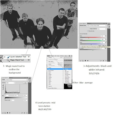
At first I did not feel entirely confident with using photoshop, so I decided to experiement before doing the final product. I was able to gain a better knowlodge of the programme. I became more familiar with the appropriate tools which I needed, such as, the 'Magic Wand', which made enabled me to highlight to necessary. This tool made the highlighting and colouring of particular parts more accurate, for example, the background.
After my practise run throughs with photoshop, I discovered the effects on 'Filter'. Here, I liked the 'blur' for the background, as it was an element which would help the band to stand out from the background.
After researching, I descovered that the black and white effect it more contemporary, therefore, would fit nicely for publising a new band.
The issue I found was that the band did not wear clothes which we had recommened, and the drummer wore a checkered shirt which was different from the rest of the band. We will therefore have to edit his shirt so that is appears black.

Monday, 21 February 2011

Communication

We have now finished our first rough edit for our music video. It is important that we continue to communicate well for the next part of our project, the DVD extras.

Sunday, 20 February 2011

Magazine cover research

The images


Example 1
Example 2


In each of Oasis's promotional posters, they are represented as bold and confident. There is a sole focus on the band members, as they have a plain background, with just the members of the group in the shot.  In example 2, there is a clear leader, Liam, who is unique from each of the others as he is in the foreground and the front of his coat is on show, where as, the other members only have their faces showing. There had obviously been a change within the group, and this poster sends the message of a dominance. This poster is older than that of example 1, which shows a progression and change within the group. In example 1, there appears to be an element of equality within the band, rather than having one of the members standing out more than the others. However, the Gallagher brothers are in the foreground, suggesting slight dominance over the rest of the group. The differences within the posters reflect the changes which have taken place in the group, for example, the greater importance of Noel. 

 The black and white is a highly bold statement and, in my opinion, massively effective. They are going back to basics,  highlighting the members themselves by using dark tonal colours, such as black, white and grey. In example 2 these colours were used in order to simply show the bands faces. This was the earlier poster, which is a good method used for new bands as it introduces the audience to the band members themselves so that their target audience are able to recognise them. The target audience has a lot to do with the image formed for bands, therefore, in the early days there is a great focus on the group members in order to collaborate a fan base and build an image from this. However, the main leader, Liam, is wearing dark glasses, elimination the eye connection with his audience and suggests a formation of a 'bad boy' image. This image co insides with their music very well, therefore, this poster is an accurate representation of both the band and their music.  Although there is still a sole focus on the band members in example 1, they have more than just their faces in the shot.  Their clothing is shown in the poster, reflecting more of their image and identity which would appeal to their brand audience. 

Magazine covers must include:
- a picture of the band and their name
- date of release
- song
- record label

Monday, 14 February 2011

Editing the main production

Whilst I edited the behind the scenes, Sarah and Lucy began to edit the main production. I believe they edited roughly the first fifty seconds of the song. Once I had completed the behind the scenes, I started helping to edit the main production.

I liked the variety of shots that the girls included, however, after looking through the footage, I believe that we should have taken more footage of Wolfie from more angles. I found the reocurring shot of a low angle of him. I suggested possibly adding in more of a variety, if we were able to find them. I also thought that the shots of the band performaning may be too long when compared to those of the narrative. We need to remember that we are trying to tell a story, as well as publicise the band, therefore, the placement of the shots are vital, as if the insuring that they are long enough for the audience to understand and follow the story.

We asked Mr Sheppard to have a look and get some feedback on what has been done so far. He was confused by the ordering of the narrative. I understood this, as there did not appear to be a particular order, for example, chronological. He also advised we revisit the lip syncing. Lucy and I therefore took all the narrative out and discussed what order should take place. I suggested starting with the arguing shots, and then introducing the happy thoughts after the shot where the individual is alone and thinking. It could be a flashback thought to the happier days, a reflection upon how far they have fallen since. We therefore chose the right shots and re order them into this placement. We got positive feedback on this change, which was greatly encouraging.

Fading
We decided to use a fade in order to make a smooth transition into the flash backs to a happier time in the narrative. It was important to use a transition so that the narrative order would be more clear to the audience. We placed these happier scenes after the shots of the individuals alone and thinking in their rooms, and by inserting a fade it would co inside with the nostalgic notion, almost a dreamy effect.

Black and White
We used a black and white light effect to make it easier to distinguish the two different parts to the narrative. We decided to adopt the black and white effect for the memories as it represents something old, a time which is in the past and is not coming back.

Friday, 4 February 2011

Location photos for the narrative

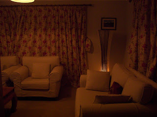
I thought a typically female room would be perfect for the phone call, as it needs to be able to reflect the typical girl, of eighteen, as that is the age of the character in the narrative. It needs to portray a sense of realism and appeal to the audience.


I thought a domestic setting was the most suitable for the narrative because we needed to make it relatable for the audience. Getting a good range of different room is important in order to show the journey through the relationship, rather than basing it on a single day in a single location. We want the audience to be able to connect with the story, and for them to do that we need to create a sense of realism and give them good enough range of footage so that they are able to empathise. 

Tuesday, 1 February 2011

Editing the behind the scenes

I imported all the behind the scenes footage onto one computer, while Lucy and Sarah imported the main footage onto another one. This way, I was able to start editing all the behind the scenes, whilst the other two focused on starting the editing for the main product. Firstly, I am focusing on the interview. After discussing the format, I believe we should put the questions onto the screen before showing the band answering said question. This is a clear way of presenting the questions and answers, rather than showing us asking the questions directly.

I have started the editing processes by watching the whole interview through and cutting all the clear and relevant questions together, as a starting point. Whilst watching, I wrote down all the questions, in order to be able to show these questions before the given answers. There should be some order to the interview, therefore, I went through all the questions and put all the similar themed ones together. I waited until the end of the editing processes before place them in the intended order.

After cutting all the answers and placing them in the timeline, I have started to create a title page, by going to 'new title', then selecting 'still role'.

I looked at behind the scenes of a Taylor Swift's music videos, such as, 'Mine' and 'Tear Drops on My Guitar' in order to gain inspiration for our behind the scenes. In both, the interview dominated, however, whilst the interview was shown, they imported footage of the actors behind the scenes. The interview was effective as the audience was able to gain a greater understanding of the band itself, as well as the individual members. I think it is vital to include the interview's so that The Vees' can start to build on there fan base, as they convey their view on music, the industry and their persoanl goals.
The behind the scenes is important in creating a sense of reality. It will allow the audience to be able to relate to the band on a greater level as they able watch their interactions and personality shining through.

I decided I would subtly add the behind the scenes whilst the interview is taking place. When a particular band member is talking, I could cut to a shot which focus's on them in particular. Also, when the band is talking about a particular topic which may fit in with the footage of them practicing or joking with one another. We want to be able to convey their personalities and love for music to the audience.