
Tuesday, 24 May 2011

Friday, 11 March 2011
Storyboard


Sarah, the director, draw up to storyboard for our music video. This involved both the performance and narrative.
Wednesday, 9 March 2011
DVD cover research
For the last part of our coursework, we need to create a DVD cover for our band. I have looked at bands of a similar genre in order to get a better idea of what needs to be involved to produce an effect cover. It is important to look at bands of a similar genre as their type of music needs to be clear from the DVD, and we can gain ideas of what is used in order to reflect this.

Oasis used a very busy, and similar pictures for both the front and back of their DVD. It isolates two of the members, suggesting two leaders within the band. The body language, sunglasses and clothing worn by the members are very relaxed and suggests a relatable notion. The DVD is clearly based around their New York tour, as it is clearly written, and has a background of New York City behind the band on both the front and back pictures. This suggests that the band has made a success internationally, promoting a accomplished band.
The name of the band is a prominent feature on the cover. They use the outlined name in a large font, which appears both on the front and back of the DVD. On the front the band name is printed three times, making the name and two main members of the band bold and stand out in their audience's memory. The use of the band name logo written in bold white with a white box around it on the front and spine of the DVD is a bold statement and makes them stand out to their current fans. It is good to have both the logo and the large font as it attracks music fans by standing out with the larger font, but also draws those current fans with the recognision on their logo.
The black background for the DVD covers, front and back, is highly effective as it makes the writing and pictures on top really stand out. The white writing of the band name and the songs on the back jump out at the observer, enouraging them to read on. The is made very clear due to the colour scheme, which is of upmost importance when promoting a band and their new songs. The pictures of the band on the front and back are also enhanced back having such a plain, dark background, as the colours and figures of the members and their backdrop stands out with ease.

The colour scheme for the Kings of Leon's DVD are highly vivid and bold. This eye catching element is a excellent promotional tool as very few people would be able to miss or skim over it. The black background achieves the same success as it does in the Oasis DVD, as the red and orange of the pictures emphasise the band members for the audience. Their faces are highlighted by the orange and red light, an effective tool in making them memorable for the audience. The same effect is made on the back as the necessary writing is bold and clear. The orange and red colour scheme is representative of heat and fire, a unique image for the band, suggesting they are 'hot' as they have a new tour and album.
Similar to Oasis, the name of the band is outlined on the front cover. This is highly effective against the black background, as it creates and red and black recognisable name. The fonts style of the name is the same when the Kings of Leon is repeated, creating a current theme and image for the band. Their logo is also on the spine which once again creates a recognisable element for their fans and the music audience.
The songs on the back are written in white and uses the largest font size, which is a good promotional device, creating clarifity and making them stand out in the audience's memory.
The pictures on the back of the back actually in performance forms a sense of reality and promoting their live performance. There is a slight order of importance in the one picture on the back of the four members together.

The font used for Stereophonics is recognisable and typically used for the band. It is the only element on the cover which uses black font. This makes it stand out against the white background other the rest of the colour scheme.The front is given depth through the sketched high rise buildings
There are a number of different colours involved in the cover, purple being the most notable.
Saturday, 5 March 2011
Production schedule
As i am taking on role of producer and director and this is a lot of work i asked team member Lucy to do the risk assessment for the production schedule then i did the rest.
Our location is Mandeville hall in Kimbolton near Huntingdon it has parking facilities and kitchen facilities for us to use along with toilets.
Full address
Thrapston Road
Kimbolton
Huntingdon
PE28 0HW
The Day
9:00-10:00 | Producer (myself) will drive to Foulksworth to pick up Lucy then to Alconbury for Helen we will then make our way to the location that is Kimbolton mediville hall. |
10:00-10:30 | The group will prepare the location for the arrival of the band practical things prepare heating etc and the mise-en-scene such as the curtains and any other props we shall use. |
10:30-11:00 | Tests of all the equipment and go through the production schedule and make sure the band and the crew know what they are doing. Clear all of the decisions made with the band. |
11:00-11:30 | Film the first take of the song in full on pure freestyle performance not to the storyboard to ensure we have enough spare footage. |
11:30-12:00 | The first 5-6 shots done twice over this includes the close up and the zoom which we will probably repeat more times. |
12:00-12:30 | Lunch break for everyone and again ensure everyone is sure on what they are doing. |
12:30-1:30 | Done all the shots on the storyboard at least once. |
1:30-2:30 | Make sure we have all storyboarded shots 2-3 times and film the song fully changing the camera angles from the previous run through. |
2:30-3:00 | Run through the song as many times as we can to feel comfortable with the amount of footage we have. |
3:00-4:00 | Pack up all equipment and clean around if we have made mess hand the key over and go. |
Useful Numbers
Emergency Services
St Neots Police Station 03454 564564 7.2 miles
Huntingdon police station 03454 564564 8.8 miles
St Neots Fire Station 01480 474601 7.1 miles
Event paramedics 01480 271030 9.3 miles
Important people
Producer/director Sarah Matthews 07596088400
Technical Lucy Rosbrook 07516873847
Design Helen Pearman 07720390661
Band Representative Tim Walpole 07525193565 /01954710365
Media teacher Brendan Sheppard
Media Teacher Alexia Smith
Hall owners Sally 01480861877
Risk Assessment
Hazards | Who’s Exposed | Risk | Control Measures | Risk |
Wires on the floor for lights and cameras etc. | Crew and band | Medium | Tidy wires- duct tape them to the floor- keep them ordered. | Medium |
Lights- get very hot | Crew and band | Medium | Wear gloves when assembling and adjusting them. Make sure they are set up correctly | Medium |
Falling off the stage | Band and crew | Low | Creating a line where people aren’t allowed to cross. Putting amps at the front of the stage, so there is a clear barrier. | Very Low |
Electric shock | Band and crew | Low | Keep water away from the equipment. Make sure there are power breakers attached to the lights. | Very Low |
Fire | Band and crew | Low | Locate fire exits and fire extinguishers. Don’t use the cooker. | Very Low |
Trip hazard- stairs and uneven ground | Band and crew | Medium | Take extra caution when walking around and take notice of signs saying ‘mind the step’ | Medium/Low |
Objects falling | Band and crew | Medium | Make sure the band and crew are aware of their surroundings and everything is set up safely. | Low |
Risk Matrix | Likelihood of Harm | ||||
Severity of harm | Remote | Unlikely | Possible | Likely | Probable |
Negligible | Medium | Medium | Low | Low | Very Low |
Slight | Low | Low | Very Low | Very Low | Very Low |
Moderate | Very Low | Very Low | Very Low | Very Low | Very Low |
Severe | Very Low | Very Low | Very Low | Very Low | Very Low |
Very Severe | Very Low | Very Low | Very Low | Very Low | Very Low |
Monday, 28 February 2011
Target audience questionnaire
How old are you? (tick the following which applied to you)
10 or under
11-15
16-20
21-25
26-30
31-40
41+
11-15
16-20
21-25
26-30
31-40
41+
What genre do you listen to the most?
Rock
Pop
Indie
Jazz
Other (name below)
What attracts you to a new band?
Fashion
Appearance
Gender
Particular and members
Their logo
Other (name below)
Do the clothes that the artists/band wear influence your fashion?
Yes
Sometimes
No
Do you prefer bands which write their own songs appeal over cover band?
Yes
No
No preference
How important is the bands interaction with one another ?
Very
Moderately
Not at all
Other (name below)
Moderately
Not at all
Other (name below)
How important is the bands interactions with their audience?
Very
Moderately
Not at all
Other (name below)
Do you prefer a leader in a band?
Yes
No
(explain the reasons behind your answer below)
Tuesday, 22 February 2011
Music video questionnaire- open ended
What is your favourite music video? Why?
Do you prefer music videos with special effects? Why?
What aspects of music videos appeal to you the most? Why?
Regarding the editing, do you prefer quick or slow cuts?
Where do you watch music videos?
Which bands have the most appealing music video? Why?
I choose to ask open ended questions for my music video research as I need to find out specific details to include in order to attract an audience. It is important to find out where people watch their music videos for promotional purposes. I also want to find out similar bands which people enjoy in order to gain inspiration and guidance.
Poster edit
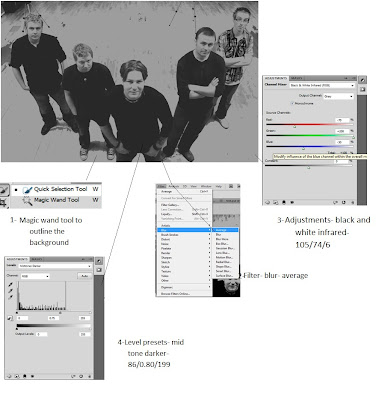
At first I did not feel entirely confident with using photoshop, so I decided to experiement before doing the final product. I was able to gain a better knowlodge of the programme. I became more familiar with the appropriate tools which I needed, such as, the 'Magic Wand', which made enabled me to highlight to necessary. This tool made the highlighting and colouring of particular parts more accurate, for example, the background.
After my practise run throughs with photoshop, I discovered the effects on 'Filter'. Here, I liked the 'blur' for the background, as it was an element which would help the band to stand out from the background.
After researching, I descovered that the black and white effect it more contemporary, therefore, would fit nicely for publising a new band.
The issue I found was that the band did not wear clothes which we had recommened, and the drummer wore a checkered shirt which was different from the rest of the band. We will therefore have to edit his shirt so that is appears black.
Monday, 21 February 2011
Communication
We have now finished our first rough edit for our music video. It is important that we continue to communicate well for the next part of our project, the DVD extras.


Sunday, 20 February 2011
Magazine cover research
The images
 |
| Example 1 |
 |
| Example 2 |
In each of Oasis's promotional posters, they are represented as bold and confident. There is a sole focus on the band members, as they have a plain background, with just the members of the group in the shot. In example 2, there is a clear leader, Liam, who is unique from each of the others as he is in the foreground and the front of his coat is on show, where as, the other members only have their faces showing. There had obviously been a change within the group, and this poster sends the message of a dominance. This poster is older than that of example 1, which shows a progression and change within the group. In example 1, there appears to be an element of equality within the band, rather than having one of the members standing out more than the others. However, the Gallagher brothers are in the foreground, suggesting slight dominance over the rest of the group. The differences within the posters reflect the changes which have taken place in the group, for example, the greater importance of Noel.
The black and white is a highly bold statement and, in my opinion, massively effective. They are going back to basics, highlighting the members themselves by using dark tonal colours, such as black, white and grey. In example 2 these colours were used in order to simply show the bands faces. This was the earlier poster, which is a good method used for new bands as it introduces the audience to the band members themselves so that their target audience are able to recognise them. The target audience has a lot to do with the image formed for bands, therefore, in the early days there is a great focus on the group members in order to collaborate a fan base and build an image from this. However, the main leader, Liam, is wearing dark glasses, elimination the eye connection with his audience and suggests a formation of a 'bad boy' image. This image co insides with their music very well, therefore, this poster is an accurate representation of both the band and their music. Although there is still a sole focus on the band members in example 1, they have more than just their faces in the shot. Their clothing is shown in the poster, reflecting more of their image and identity which would appeal to their brand audience.
Magazine covers must include:
- a picture of the band and their name
- date of release
- song
- record label
Monday, 14 February 2011
Editing the main production
Whilst I edited the behind the scenes, Sarah and Lucy began to edit the main production. I believe they edited roughly the first fifty seconds of the song. Once I had completed the behind the scenes, I started helping to edit the main production.
I liked the variety of shots that the girls included, however, after looking through the footage, I believe that we should have taken more footage of Wolfie from more angles. I found the reocurring shot of a low angle of him. I suggested possibly adding in more of a variety, if we were able to find them. I also thought that the shots of the band performaning may be too long when compared to those of the narrative. We need to remember that we are trying to tell a story, as well as publicise the band, therefore, the placement of the shots are vital, as if the insuring that they are long enough for the audience to understand and follow the story.
We asked Mr Sheppard to have a look and get some feedback on what has been done so far. He was confused by the ordering of the narrative. I understood this, as there did not appear to be a particular order, for example, chronological. He also advised we revisit the lip syncing. Lucy and I therefore took all the narrative out and discussed what order should take place. I suggested starting with the arguing shots, and then introducing the happy thoughts after the shot where the individual is alone and thinking. It could be a flashback thought to the happier days, a reflection upon how far they have fallen since. We therefore chose the right shots and re order them into this placement. We got positive feedback on this change, which was greatly encouraging.
Fading
We decided to use a fade in order to make a smooth transition into the flash backs to a happier time in the narrative. It was important to use a transition so that the narrative order would be more clear to the audience. We placed these happier scenes after the shots of the individuals alone and thinking in their rooms, and by inserting a fade it would co inside with the nostalgic notion, almost a dreamy effect.
Black and White
We used a black and white light effect to make it easier to distinguish the two different parts to the narrative. We decided to adopt the black and white effect for the memories as it represents something old, a time which is in the past and is not coming back.
Friday, 4 February 2011
Location photos for the narrative


I thought a domestic setting was the most suitable for the narrative because we needed to make it relatable for the audience. Getting a good range of different room is important in order to show the journey through the relationship, rather than basing it on a single day in a single location. We want the audience to be able to connect with the story, and for them to do that we need to create a sense of realism and give them good enough range of footage so that they are able to empathise.
Tuesday, 1 February 2011
Editing the behind the scenes
I imported all the behind the scenes footage onto one computer, while Lucy and Sarah imported the main footage onto another one. This way, I was able to start editing all the behind the scenes, whilst the other two focused on starting the editing for the main product. Firstly, I am focusing on the interview. After discussing the format, I believe we should put the questions onto the screen before showing the band answering said question. This is a clear way of presenting the questions and answers, rather than showing us asking the questions directly.
I have started the editing processes by watching the whole interview through and cutting all the clear and relevant questions together, as a starting point. Whilst watching, I wrote down all the questions, in order to be able to show these questions before the given answers. There should be some order to the interview, therefore, I went through all the questions and put all the similar themed ones together. I waited until the end of the editing processes before place them in the intended order.
After cutting all the answers and placing them in the timeline, I have started to create a title page, by going to 'new title', then selecting 'still role'.
I looked at behind the scenes of a Taylor Swift's music videos, such as, 'Mine' and 'Tear Drops on My Guitar' in order to gain inspiration for our behind the scenes. In both, the interview dominated, however, whilst the interview was shown, they imported footage of the actors behind the scenes. The interview was effective as the audience was able to gain a greater understanding of the band itself, as well as the individual members. I think it is vital to include the interview's so that The Vees' can start to build on there fan base, as they convey their view on music, the industry and their persoanl goals.
The behind the scenes is important in creating a sense of reality. It will allow the audience to be able to relate to the band on a greater level as they able watch their interactions and personality shining through.
I decided I would subtly add the behind the scenes whilst the interview is taking place. When a particular band member is talking, I could cut to a shot which focus's on them in particular. Also, when the band is talking about a particular topic which may fit in with the footage of them practicing or joking with one another. We want to be able to convey their personalities and love for music to the audience.
Thursday, 27 January 2011
Narrative designs
Female
For the happy scene I think the girls clothes should reflect this. For example, the use of warm and happy colours, e.g. red coat, and floral top. Simple jeans will reinforce the notion of realism. A hat could show the slightly cooler weather and the importance of staying close. When indoors, the girl could head band, reflecting the effort that she makes when around her partner, and the floral effect would reinforce the joy and girly stereotypical notion. Her clothing needs to be able to reflect her mood and passion towards her partner, another way of demonstrating the emotions within the relationship to the audience.
The clothing is very important as it represents each character, therefore, the female femininity needs to be strongly demonstrated.
The sad scenes are highly important, thereforek, her clothing needs to be a lot less bright. The colour scheme posibily black and grey. A big jumper would reflect a lack of care which the female has adopted due to the circumstances. The idea of clothes serving the purpose of comfort rather than attraction needs to be illustrated through these scenes. Plain black leggings would fulfil this idea, as would a bigger t-shirt.

Male
The male outfit is less important, as the idea of the importance of fashion is cermented to a greater degree in women, especially in the media. However, the design still holds a certain importance with the male. His fashion needs to be able to reflect that of their younger male audience. Therefore, a polo top and jeans are the most sensible option. The change in moods does not need to effect the male's outfit to such an extent, however, it may need to be considered. Perhaps within the happier scenes his clothing is smarter, for example, a polo shirt, rather than the solemn scenes, where he may wear a plain t shirt instead.
For the happy scene I think the girls clothes should reflect this. For example, the use of warm and happy colours, e.g. red coat, and floral top. Simple jeans will reinforce the notion of realism. A hat could show the slightly cooler weather and the importance of staying close. When indoors, the girl could head band, reflecting the effort that she makes when around her partner, and the floral effect would reinforce the joy and girly stereotypical notion. Her clothing needs to be able to reflect her mood and passion towards her partner, another way of demonstrating the emotions within the relationship to the audience.
The clothing is very important as it represents each character, therefore, the female femininity needs to be strongly demonstrated.
The sad scenes are highly important, thereforek, her clothing needs to be a lot less bright. The colour scheme posibily black and grey. A big jumper would reflect a lack of care which the female has adopted due to the circumstances. The idea of clothes serving the purpose of comfort rather than attraction needs to be illustrated through these scenes. Plain black leggings would fulfil this idea, as would a bigger t-shirt.
 |
| For the happy scenes: colourful to represent her happiness. |
 |
| Happy scenes |

 |
| Sad scenes |
 |
| Sad scenes |
Male
The male outfit is less important, as the idea of the importance of fashion is cermented to a greater degree in women, especially in the media. However, the design still holds a certain importance with the male. His fashion needs to be able to reflect that of their younger male audience. Therefore, a polo top and jeans are the most sensible option. The change in moods does not need to effect the male's outfit to such an extent, however, it may need to be considered. Perhaps within the happier scenes his clothing is smarter, for example, a polo shirt, rather than the solemn scenes, where he may wear a plain t shirt instead.
Subscribe to:
Comments (Atom)